Work Samples
Work Samples
Résumé Samples
Workforce Re-entrant / Employment Gap Coverage
A human resources specialist who had been out of the paid workforce for more than 15 years raising a family came and asked for help with her résumé and LinkedIn profile, in re-entering the workforce.
Here’s the résumé she had created: MBA-HR-Manager-BEFORE
Here’s the résumé we created together in a Writing Session Appointment: MBA-HR-Manager-AFTER
Under Experience you will see a short-term seasonal position, then previous industry work experience. Notice where your eye goes first as you scan this résumé. The old experience is presented with a lot of detail. It might take you a moment to see the gap, but it is not hidden at all.
Customarily we would not include details for experience older than 10 to 15 years maximum. That is the rule and it is a good and important rule, for two reasons: information from 15+ years ago is no longer fresh, and listing jobs going back that far with dates potentially opens you to age discrimination.
In this case, however, Dori made two wise moves. First, she said “Yes” to a short seasonal position which did not require a degree—even though she has an MBA. She knew it was a strategic stepping stone, back into her field. Very smart! Now she is able to present at the top of her résumé very recent field experience, with current software and technical tools. The résumé ranks high enough with top-placed keywords to pass the ATS scan. Any questions that come up about the gap are answered by the extensive volunteer work we cover later on under a different heading.
The other strategic move: she applied for a permanent position at the same company she’d done good seasonal work for. Very smart! The easiest way to finding work at the company you work for already or have worked for in the past. She sailed through all interviews and landed a full-time position that requires an MBA. It is still not the senior position she’s after, it’s another stepping stone, but she’s solidly back in the workforce.
Graphic Résumés
Here is are two résumés for a fine artist who was seeking work as an art teacher Fine-Artist-Teacher
and as an animal technician Fine-Artist-AnimalTech.
In this example, a client wanted a graphic résumé illustrating her 20-year career at a major corporation. It is four pages and designed to be printed on 17×11 paper.
Page 1 (the cover) GraphicResumeK_pp1
Pages 2-3 (interior) GraphicResume-K_pp2-3-17x11_anon 2
Page 4 (back page) GraphicResume-K_pp4_anon 2
Many more samples of resumes are available upon request!
Book Sample – GETTING I.T. RIGHT
Getting I.T. Right — click on the Paperback version, “Look Inside” to see a sample of substantive editing (including writing the intro) as well as book design including illustrations.
Book Sample – WORD MARKETING
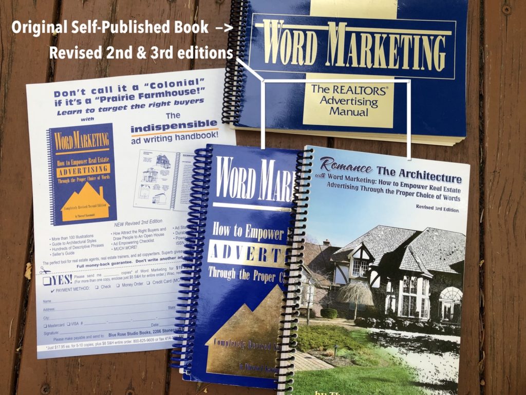
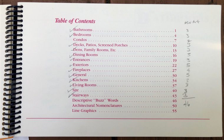
Below shows the original table of contents of the 1991 self-published book. Note the landscape orientation, ink color, and how all of the graphics began on page 55.
Keeping with the author’s intention — to teach agents to write ads incorporating architectural styles and features — illustrations are carefully labeled. Content is well organized into clear sections.
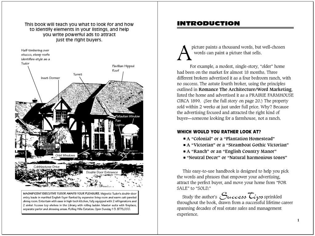
Excerpt from the 3rd Revised Edition, showing writing, page design, and typography.
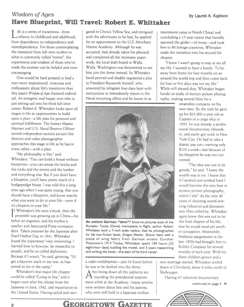
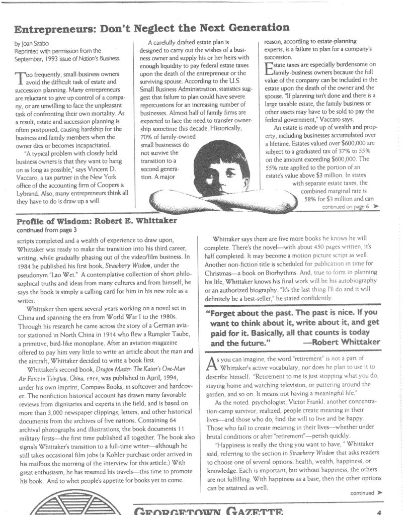
Below is a sample of my writing, an short biographical article about an author I was working with at the time, doing marketing and cover design for his book, Dragon Master. This article was published in a financial newsletter targeted to retirees. I love telling biographical stories and memoirs.
